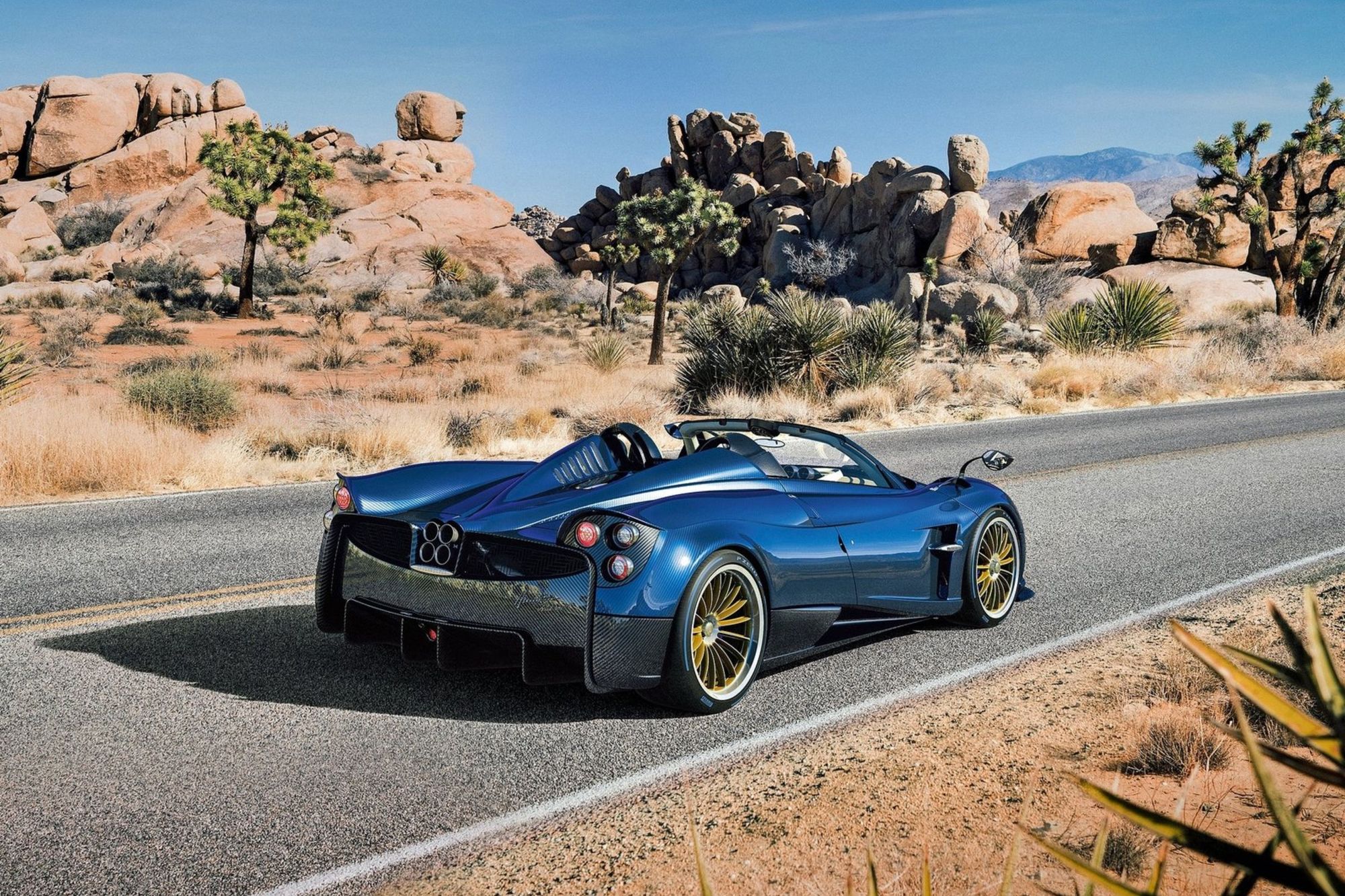
I adore the Pagani Huayra. I love the thunderous noise its twin-turbocharged V12 makes. I love the way it makes passerby crane their neck to catch a second, third, and fourth glance as it drives by. And I love the unbridled passion of Horacio Pagani, the founder and captain at the brand’s helm.
But.
Contrary to public opinion, I have long thought that the Huayra’s interior is simply not all it is cracked up to be.

The Huayra-shaped key fob protruding from the dashboard looks ridiculous. The instrument binnacle is glitzy. And the height adjustment knobs at the base of each seat look awfully suggestive when in use.
However, by far, the Huayra’s worst interior design offence is its touchscreen.

As a general rule, I think screens should be banned from supercar dashboards. Not only do they tend to date quicker than grapes left in the sun, but they reek of lazy interior design. You don’t see Bugatti strapping a gargantuan cinema screen to the Chiron’s dash.
The Huayra’s unit is particularly distasteful. When changing radio stations your hand enters another postcode before reaching the recessed screen.
What were they thinking?


